library(sf) library(dplyr) library(spDataLarge) library(stplanr)# for processing geographic transport data library(tmap)# map making (see Chapter 9) library(ggplot2)# data visualization package library(sfnetworks)# spatial network classes and functions
This highlights an important feature of transport systems: they are closely linked to broader phenomena and land-use patterns.
另一个关键层次是代理,如你我以及使我们能够移动的交通工具,比如自行车和公交车。这些可以在像MATSim和A/B Street这样的软件中以计算方式表示,它们使用基于代理的建模(ABM)框架,通常具有很高的空间和时间分辨率,来表示交通系统的动态性(Horni,Nagel 和 Axhausen 2016)。尽管ABM是一种具有很大整合潜力的强大的交通研究方法,尤其是与R的空间类(Thiele 2014; Lovelace and Dumont 2016) ,但它不在本章的范围内。除了地理层次和代理之外,许多交通模型中的基本分析单位是行程,即从一个起点’A’到一个终点’B’的单一目的地之旅(Hollander 2016)。行程连接了交通系统的不同层次,并可以简单地表示为连接区域质心(节点)的地理需求线,或作为遵循交通路线网络的路线。在这种情况下,代理人通常是在交通网络内移动的点实体。
交通系统是动态的(Xie and Levinson 2011)。尽管本章的重点是交通系统的地理分析,但它也提供了如何使用这种方法来模拟变化情景的见解,在第13.8节中有介绍。地理交通建模的目的可以理解为以捕捉其本质的方式简化这些时空系统的复杂性。选择适当的地理分析层次可以在不失去其最重要的特征和变量的情况下,简化这种复杂性,从而实现更好的决策和更有效的干预(Hollander 2016)。
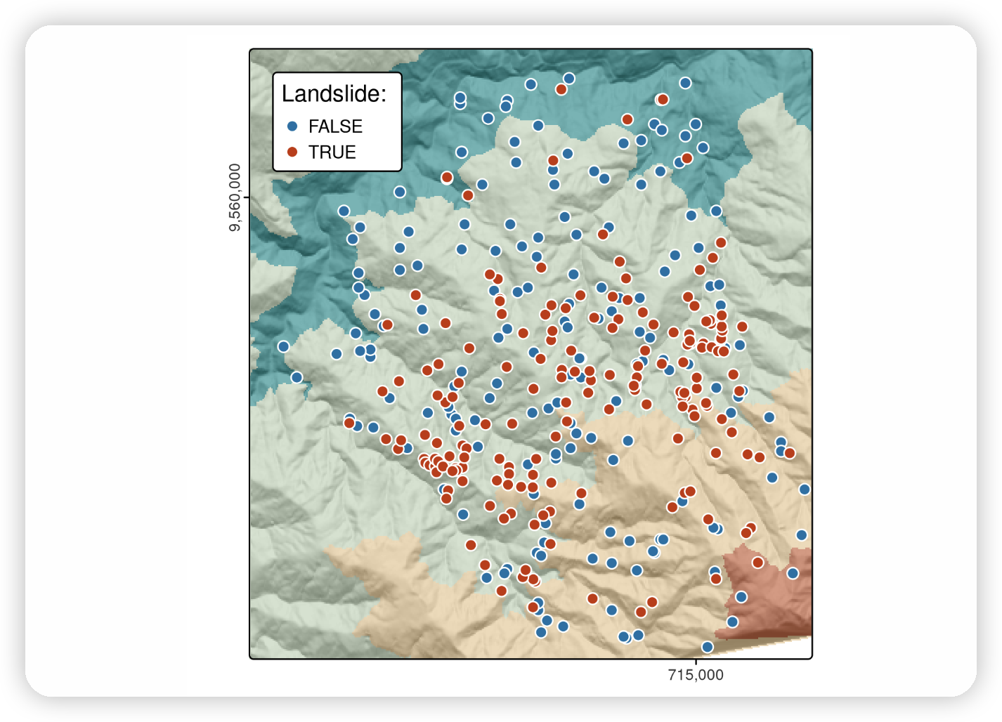
Bristol’s transport network represented by colored lines for active (green), public (railways, black) and private motor (red) modes of travel. Black border lines represent the inner city boundary (highlighted in yellow) and the larger Travel To Work Area (TTWA).
Number of trips (commuters) living and working in the region. The left map shows zone of origin of commute trips; the right map shows zone of destination (generated by the script 13-zones.R).
Desire lines representing trip patterns in Bristol, with width representing number of trips and color representing the percentage of trips made by active modes (walking and cycling). The four black lines represent the interzonal OD pairs in Table 7.1.
Station nodes (red dots) used as intermediary points that convert straight desire lines with high rail usage (thin green lines) into three legs: to the origin station (orange) via public transport (blue) and to the destination (pink, not visible because it is so short).
R包用于计算和导入代表交通网络上路由的数据的广泛范围是一种优势,这意味着该语言近年来越来越多地用于交通研究。然而,这种包和方法的激增的一个小缺点是有很多包和函数名称需要记住。 stplanr 包通过提供一个用于生成路由的统一接口 route() 函数来解决这个问题。该函数接受广泛的输入,包括地理欲望线(使用 l = 参数)、坐标甚至表示独特地址的文本字符串,并返回作为一致 sf 对象的路由数据。
输出是 routes_short,一个代表适用于骑自行车的交通网络上的路线的 sf 对象(至少根据 OSRM 路由引擎是这样),每个期望线对应一个。注意:像上面的命令中那样调用外部路由引擎只有在有互联网连接的情况下才能工作(有时还需要存储在环境变量中的 API 密钥,尽管在这种情况下不需要)。除了 desire_lines 对象中包含的列之外,新的路线数据集还包含 distance(这次是指路线距离)和 duration(以秒为单位)列,这些提供了有关每条路线性质的潜在有用额外信息。我们将绘制沿着这些线路进行许多短途汽车行驶的期望线和骑行路线。通过使路线的宽度与可能被替换的汽车行驶数量成比例,提供了一种有效的方式来优先考虑对道路网络进行干预(Lovelace 等 2017)。
下面的代码块绘制了期望线和路线,该图显示了人们驾驶短距离的路线:^13-transport-8
Routes along which many (100+) short (<5km Euclidean distance) car journeys are made (red) overlaying desire lines representing the same trips (black) and zone centroids (dots).
Illustration of the percentage of car trips switching to cycling as a function of distance (left) and route network level results of this function (right).
Illustration of route network datasets. The grey lines represent a simplified road network, with segment thickness proportional to betweenness. The green lines represent potential cycling flows (one way) calculated with the code above
#> Warning: Some legend items or map compoments do not fit well (e.g. due to the #> specified font size).
Potential routes along which to prioritise cycle infrastructure in Bristol to reduce car dependency. The static map provides an overview of the overlay between existing infrastructure and routes with high car-bike switching potential (left). The screenshot the interactive map generated from the qtm() function highlights Whiteladies Road as somewhere that would benefit from a new cycleway (right).
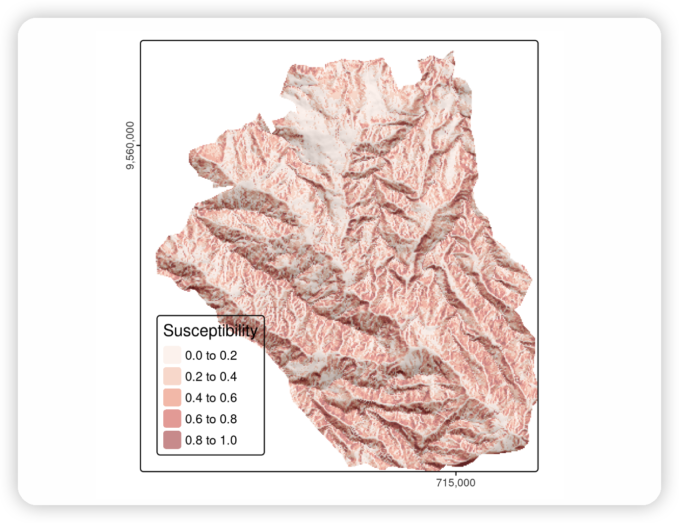
统计学习主要关注使用统计和计算模型来识别数据中的模式,并根据这些模式进行预测。由于其起源,统计学习是 R 语言的一大优势(见章节地理计算软件)。^[几十年来,将统计技术应用于地理数据一直是地统计学、空间统计学和点模式分析领域中的一个活跃的研究课题。统计学习结合了统计和机器学习的方法,并可分为监督和无监督技术。这两者越来越多地应用于从物理学、生物学和生态学到地理学和经济学等各个学科]。
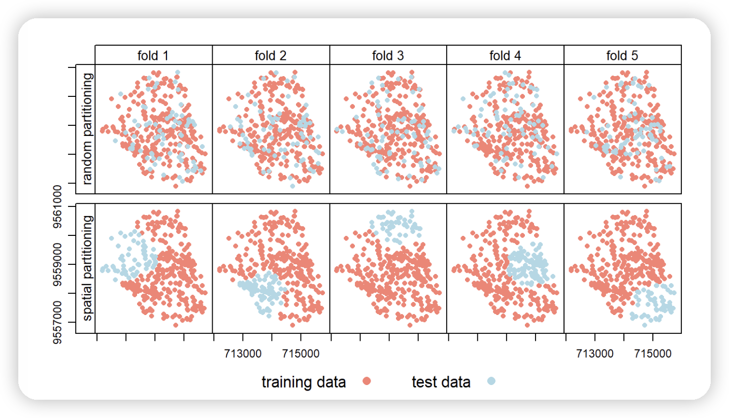
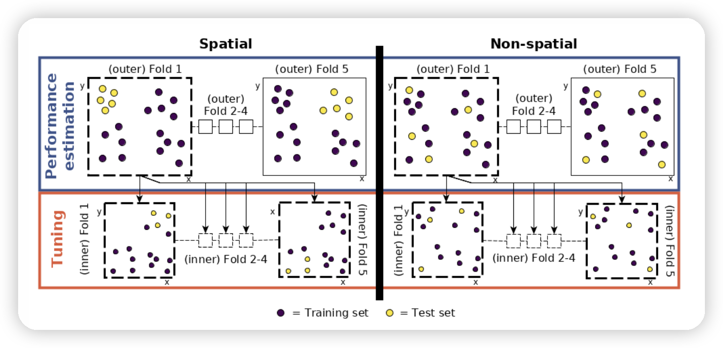
Spatial visualization of selected test and training observations for cross-validation of one repetition. Random (upper row) and spatial partitioning (lower row).
# plot response against each predictor mlr3viz::autoplot(task, type ="duo") # plot all variables against each other mlr3viz::autoplot(task, type ="pairs")
Schematic of hyperparameter tuning and performance estimation levels in CV. [Figure was taken from Schratz et al. (2019). Permission to reuse it was kindly granted.]
library(future) # execute the outer loop sequentially and parallelize the inner loop future::plan(list("sequential","multisession"), workers =floor(availableCores()/2))
Code checking in RStudio. This example, from the script 11-centroid-alg.R, highlights an unclosed curly bracket on line 19.
📌A useful tool for reproducibility is the reprex package.
Its main function reprex() tests lines of R code to check if they are reproducible, and provides markdown output to facilitate communication on sites such as GitHub.
See the web page reprex.tidyverse.org for details.
式中,$A$到$C$是三角形的三个点,而$x$和$y$分别指代 x 和 y 的维度。将这个公式翻译成能够处理矩阵表示形式的三角形 T1 数据的 R 代码如下(函数 abs() 确保了结果为正):
1 2 3 4 5
# calculate the area of the triangle represented by matrix T1: abs(T1[1,1]*(T1[2,2]- T1[3,2])+ T1[2,1]*(T1[3,2]- T1[1,2])+ T1[3,1]*(T1[1,2]- T1[2,2]))/2 #> [1] 85
该代码块输出了正确的结果。^[可以用以下公式(该公式假设底边是水平的)来验证结果:面积是底边宽度与高度乘积的一半,$A = B * H / 2$。在这种情况下 $10 * 10 / 2 = 50$。]问题在于代码比较笨拙,如果我们想要在另一个三角形矩阵上运行它,就必须重新键入。为了使代码更具通用性,我们将在函数节中看到如何将其转换为一个函数。
第4步要求在所有三角形上(如上面所示),而不仅仅是一个三角形上,进行第2步和第3步。这就需要迭代以创建表示多边形的所有三角形,如下图所示。这里使用 lapply()和 vapply()来迭代每个三角形,因为它们在基础 R 中提供了一个简洁的解决方案:^[有关文档,请参见 ?lapply,更多关于迭代的信息,请参见第@ref(location)章。]
1 2 3 4 5 6 7 8 9 10 11 12 13
i =2:(nrow(poly_mat)-2) T_all = lapply(i,function(x){ rbind(Origin, poly_mat[x:(x +1),], Origin) })
C_list = lapply(T_all,function(x)(x[1,]+ x[2,]+ x[3,])/3) C = do.call(rbind, C_list)
Illustration of iterative centroid algorithm with triangles. The X represents the area-weighted centroid in iterations 2 and 3.
现在,我们有条件完成第4步,使用sum(A)来计算总面积,以及使用 weighted.mean(C[, 1], A) 和 weighted.mean(C[, 2], A) 来计算多边形的质心坐标(给警觉的读者一个练习:验证这些命令是否有效)。为了展示算法与脚本之间的联系,本节的内容已经被压缩成 11-centroid-alg.R。我们在脚本节末尾看到,这个脚本如何计算一个正方形的质心。编写脚本 的优点是,它适用于新的 poly_mat 对象(参见下面的练习,以 st_centroid() 为参考来验证这些结果):
1 2 3
source("code/11-centroid-alg.R") #> [1] "The area is: 245" #> [1] "The coordinates of the centroid are: 8.83, 9.22"
上面的示例表明,使用基础 R 从基础原理出发,确实可以开发出低级地理操作。它还表明,如果已经存在一个经过验证的解决方案,那么重新发明轮子可能是不值得的:如果我们的目标仅仅是找到多边形的质心\index{centroid},那么将poly_mat表示为一个sf对象并使用现有的sf::st_centroid() 函数可能会更快。然而,从1^st^ 原理编写算法的巨大好处是,你将理解整个过程的每一个步骤,这是使用其他人代码时无法保证的。另一个需要考虑的因素是性能,与低级语言如C++相比,R在进行数字计算方面可能较慢(参见地理计算软件节),并且难以优化。如果目的是开发新方法,那么计算效率不应该是优先考虑的。这一点体现在“过早优化是编程中一切(或至少大部分)邪恶的根源”[@knuth_computer_1974]这一说法中。
R 等具有交互式控制台的语言的一个特点——严格来说是一个读取-求值-打印循环(REPL)—— 是你与它们互动的方式。与其依赖于在屏幕的不同部分上指点和点击,你可以将命令键入控制台,并使用 Enter 键执行它们。使用像RStudio或VS Code这样的交互式开发环境时,一个常见且有效的工作流程是将代码键入源文件的源编辑器中,并使用像Ctrl+Enter这样的快捷方式来控制代码的交互式执行。
# remotes::install_github("r-tmap/tmap@v4") library(tmap)# for static and interactive maps library(leaflet)# for interactive maps library(ggplot2)# tidyverse data visualization package
tmap是一个功能强大且灵活的制图软件包,具有合理的默认设置。它具有简洁的语法,允许使用最少的代码创建具有吸引力的地图,这对于 ggplot2 用户来说会非常熟悉。它还具有独特的功能,通过tmap_mode()可以生成静态和交互式地图,使用相同的代码。最后,它接受比其他替代方案(如 ggplot2)更广泛的空间类别(包括 sf 和 terra 对象)。
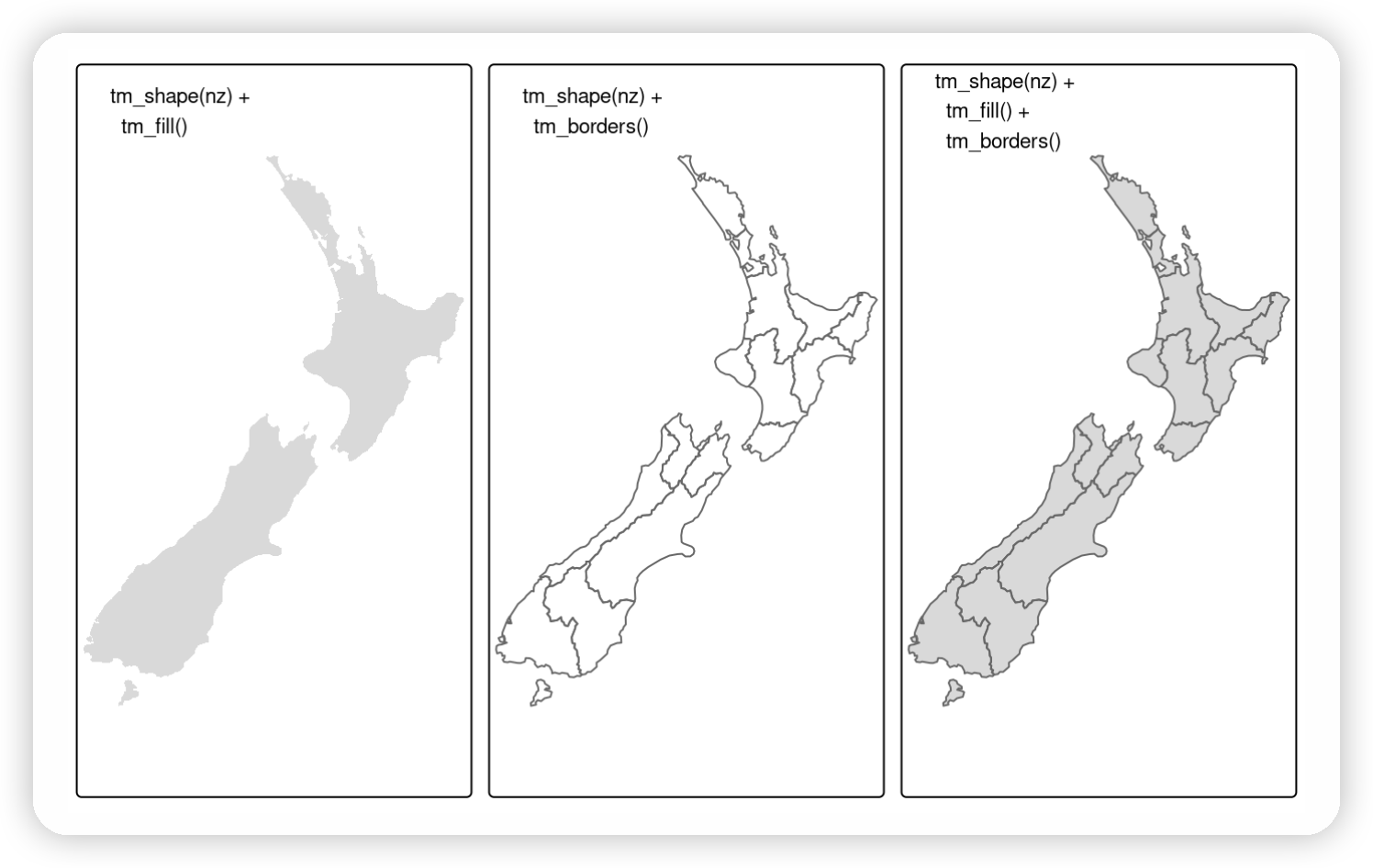
# Add fill layer to nz shape tm_shape(nz)+ tm_fill() # Add border layer to nz shape tm_shape(nz)+ tm_borders() # Add fill and border layers to nz shape tm_shape(nz)+ tm_fill()+ tm_borders()
New Zealand’s shape plotted with fill (left), border (middle) and fill and border (right) layers added using tmap functions.
Building on the previously created map_nz object, the preceding code creates a new map object map_nz1 that contains another shape (nz_elev) representing average elevation across New Zealand (see Figure @ref(fig:tmlayers), left).
More shapes and layers can be added, as illustrated in the code chunk below which creates nz_water, representing New Zealand’s territorial waters, and adds the resulting lines to an existing map object.
There is no limit to the number of layers or shapes that can be added to tmap objects, and the same shape can even be used multiple times.
The final map illustrated in Figure @ref(fig:tmlayers) is created by adding a layer representing high points (stored in the object nz_height) onto the previously created map_nz2 object with tm_symbols() (see ?tm_symbols for details on tmap’s point plotting functions).
The resulting map, which has four layers, is illustrated in the right-hand panel of Figure @ref(fig:tmlayers):
A useful and little known feature of tmap is that multiple map objects can be arranged in a single ‘metaplot’ with tmap_arrange().
This is demonstrated in the code chunk below which plots map_nz1 to map_nz3, resulting in Figure @ref(fig:tmlayers).
1
tmap_arrange(map_nz1, map_nz2, map_nz3)
(\#fig:tmlayers)Maps with additional layers added to the final map of Figure 9.1.
More elements can also be added with the + operator.
Aesthetic settings, however, are controlled by arguments to layer functions.
可视化变量
The plots in the previous section demonstrate tmap’s default aesthetic settings.
Gray shades are used for tm_fill() and tm_symbols() layers and a continuous black line is used to represent lines created with tm_lines().
Of course, these default values and other aesthetics can be overridden.
The purpose of this section is to show how.
There are two main types of map aesthetics: those that change with the data and those that are constant.
Unlike ggplot2, which uses the helper function aes() to represent variable aesthetics, tmap accepts a few aesthetic arguments, depending on a selected layer type:
fill: fill color of a polygon
col: color of a polygon border, line, point, or raster
lwd: line width
lty: line type
size: size of a symbol
shape: shape of a symbol
Additionally, we may customize the fill and border color transparency using fill_alpha and col_alpha.
To map a variable to an aesthetic, pass its column name to the corresponding argument, and to set a fixed aesthetic, pass the desired value instead.[^1]
The impact of setting these with fixed values is illustrated in Figure @ref(fig:tmstatic).
[^1]: If there is a clash between a fixed value and a column name, the column name takes precedence.
This can be verified by running the next code chunk after running nz$red = 1:nrow(nz).
(\#fig:tmstatic)The impact of changing commonly used fill and border aesthetics to fixed values.
Like base R plots, arguments defining aesthetics can also receive values that vary.
Unlike the base R code below (which generates the left panel in Figure @ref(fig:tmcol)), tmap aesthetic arguments will not accept a numeric vector:
1 2 3
plot(st_geometry(nz), col = nz$Land_area)# works tm_shape(nz)+ tm_fill(col = nz$Land_area)# fails #> Error: palette should be a character value
Instead col (and other aesthetics that can vary such as lwd for line layers and size for point layers) requires a character string naming an attribute associated with the geometry to be plotted.
Thus, one would achieve the desired result as follows (plotted in the right-hand panel of Figure @ref(fig:tmcol)):
1
tm_shape(nz)+ tm_fill(fill ="Land_area")
(\#fig:tmcol)Comparison of base (left) and tmap (right) handling of a numeric color field.
Each visual variable has three related additional arguments, with prefixes of .scale, .legend, and .free.
For example, the tm_fill() function has arguments such as fill, fill.scale, fill.legend, and fill.free.
The .scale argument determines how the provided values are represented on the map and in the legend (Section @ref(scales)), while the .legend argument is used to customize the legend settings, such as its title, orientation, or position (Section @ref(legends)).
The .free argument is relevant only for maps with many facets to determine if each facet has the same or different scale and legend (Section @ref(faceted-maps)).
标度
\index{tmap (package)!scales} Scales control how the values are represented on the map and in the legend, and largely depend on the selected visual variable.
For example, when our visual variable is col, then col.scale controls how the colors of spatial objects are related to the provided values; and when our visual variable is size, then size.scale controls how the sizes represent the provided values.
By default, the used scale is tm_scale(), which selects the visual settings automatically given by the data type (factor, numeric, and integer).
\index{tmap (package)!color breaks} Let’s see how the scales work by customizing polygons’ fill colors.
Color settings are an important part of map design – they can have a major impact on how spatial variability is portrayed as illustrated in Figure @ref(fig:tmpal).
This figure shows four ways of coloring regions in New Zealand depending on median income, from left to right (and demonstrated in the code chunk below):
The default setting uses ‘pretty’ breaks, described in the next paragraph
breaks allows you to manually set the breaks
n sets the number of bins into which numeric variables are categorized
values defines the color scheme, for example, BuGn
(\#fig:tmpal)Illustration of settings that affect color settings. The results show (from left to right): default settings, manual breaks, n breaks, and the impact of changing the palette.
\BeginKnitrBlock{rmdnote}
All of the above arguments (breaks, n, and values) also work for other types of visual variables.
For example, values expects a vector of colors or a palette name for fill.scale or col.scale, a vector of sizes for size.scale, or a vector of symbols for shape.scale.
\EndKnitrBlock{rmdnote}
\index{tmap (package)!break styles} We are also able to customize scales using a family of functions that start with the tm_scale_ prefix.
The most important ones are tm_scale_intervals(), tm_scale_continuous(), and tm_scale_categorical().
\index{tmap (package)!interval scale} The tm_scale_intervals() function splits the input data values into a set of intervals.
In addition to manually setting breaks,tmap allows users to specify algorithms to create breaks with the style argument automatically.
Here are some of the most useful scale functions (Figure @ref(fig:break-styles)):
style = "pretty": the default setting, rounds breaks into whole numbers where possible and spaces them evenly
style = "equal": divides input values into bins of equal range and is appropriate for variables with a uniform distribution (not recommended for variables with a skewed distribution as the resulting map may end-up having little color diversity)
style = "quantile": ensures the same number of observations fall into each category (with the potential downside that bin ranges can vary widely)
style = "jenks": identifies groups of similar values in the data and maximizes the differences between categories
style = "log10_pretty": a common logarithmic (the logarithm to base 10) version of the regular pretty style used for variables with a right-skewed distribution
\BeginKnitrBlock{rmdnote}
Although style is an argument of tmap functions, in fact it originates as an argument in classInt::classIntervals() — see the help page of this function for details.
\EndKnitrBlock{rmdnote}
(\#fig:break-styles)Illustration of different interval scales' methods set using the style argument in tmap.
\index{tmap (package)!continuous scale} The tm_scale_continuous() function present a large number of colors over continuous color fields and are particularly suited for continuous rasters.
In case of variables with skewed distribution you can also use its variants – tm_scale_continuous_log() and tm_scale_continuous_log1p().
\index{tmap (package)!categorical scale} Finally, tm_scale_categorical() was designed to represent categorical values and assures that each category receives a unique color (Figure @ref(fig:concat)).
1 2 3 4 5 6 7 8 9 10
#> Warning in strwidth(comp$text, units = "inch", family = comp$fontfamily, : no #> font could be found for family "monospace"
#> Warning in strwidth(comp$text, units = "inch", family = comp$fontfamily, : no #> font could be found for family "monospace" #> Warning in strwidth(comp$text, units = "inch", family = comp$fontfamily, : font #> family 'monospace' not found, will use 'sans' instead
#> Warning in strwidth(comp$text, units = "inch", family = comp$fontfamily, : font #> family 'monospace' not found, will use 'sans' instead
(\#fig:concat)Illustration of continuous and categorical scales in tmap.
\index{tmap (package)!palettes} Palettes define the color ranges associated with the bins and determined by the tm_scale_*() functions, and its breaks and n arguments described above.
The default color palette is specified in tm_layout() (see Section @ref(layouts) to learn more); however, it could be quickly changed using the values argument.
It expects a vector of colors or a new color palette name, which can be find interactively with cols4all::c4a_gui().
You can also add a - as the color palette name prefix to reverse the palette order.
\BeginKnitrBlock{rmdnote}
All of the default values of the visual variables, such as default color palettes for different types of input variables, can be found with tmap_options()$values.var.
\EndKnitrBlock{rmdnote}
There are three main groups of color palettes\index{map making!color palettes}: categorical, sequential and diverging (Figure @ref(fig:colpal)), and each of them serves a different purpose.[^2]
Categorical palettes consist of easily distinguishable colors and are most appropriate for categorical data without any particular order such as state names or land cover classes.
Colors should be intuitive: rivers should be blue, for example, and pastures green.
Avoid too many categories: maps with large legends and many colors can be uninterpretable.
[^2]: A fourth group of color palettes, called bivariate, also exists.
They are used when we want to represent relations between two variables on one map.
The second group is sequential palettes.
These follow a gradient, for example from light to dark colors (light colors often tend to represent lower values), and are appropriate for continuous (numeric) variables.
Sequential palettes can be single (greens goes from light to dark blue, for example) or multi-color/hue (yl_gn_bu is gradient from light yellow to blue via green, for example), as demonstrated in the code chunk below — output not shown, run the code yourself to see the results!
The third group, diverging palettes, typically range between three distinct colors (purple-white-green in Figure @ref(fig:colpal)) and are usually created by joining two single-color sequential palettes with the darker colors at each end.
Their main purpose is to visualize the difference from an important reference point, e.g., a certain temperature, the median household income or the mean probability for a drought event.
The reference point’s value can be adjusted in tmap using the midpoint argument.
(\#fig:colpal)Examples of categorical, sequential and diverging palettes.
There are two important principles for consideration when working with colors: perceptibility and accessibility.
Firstly, colors on maps should match our perception.
This means that certain colors are viewed through our experience and also cultural lenses.
For example, green colors usually represent vegetation or lowlands and blue is connected with water or cool.
Color palettes should also be easy to understand to effectively convey information.
It should be clear which values are lower and which are higher, and colors should change gradually.
Secondly, changes in colors should be accessible to the largest number of people.
Therefore, it is important to use colorblind friendly palettes as often as possible.[^3]
[^3]: See the “Color vision” options and the “Color Blind Friendliness” panel in cols4all::c4a_gui().
图例
\index{tmap (package)!legends} After we decided on our visual variable and its properties, we should move our attention toward the related map legend style.
Using the tm_legend() function, we may change its title, position, orientation, or even disable it.
The most important argument in this function is title, which sets the title of the associated legend.
In general, a map legend title should provide two pieces of information: what the legend represents and what are the units of the presented variable.
The following code chunk demonstrates this functionality by providing a more attractive name than the variable name Land_area (note the use of expression() to create superscript text):
The default legend orientation in tmap is "portrait", however, an alternative legend orientation, "landscape", is also possible.
Other than that, we can also customize the location of the legend using the position argument.
The legend position (and also the position of several other map elements in tmap) can be customized using one of a few functions.
The two most important are:
tm_pos_out(): the default, adds the legend outside of the map frame area. We can customize its location with two values that represent the horizontal position ("left", "center", or "right"), and the vertical position ("bottom", "center", or "top")
tm_pos_in(): puts the legend inside of the map frame area. We may decided on its position using two arguments, where the first one can be "left", "center", or "right", and the second one can be "bottom", "center", or "top".
Alternatively, we may just provide a vector of two values (or two numbers between 0 and 1) here – and in such case, the legend will be put inside the map frame.
布局
\index{tmap (package)!layouts} The map layout refers to the combination of all map elements into a cohesive map.
Map elements include among others the objects to be mapped, the title, the scale bar, the map grid, and margins, while the color settings covered in the previous section relate to the palette and break-points used to affect how the map looks.
Both may result in subtle changes that can have an equally large impact on the impression left by your maps.
Additional map elements such as graticules \index{tmap (package)!graticules}, north arrows\index{tmap (package)!north arrows}, scale bars\index{tmap (package)!scale bars} and map titles have their own functions: tm_graticules(), tm_compass(), tm_scalebar(), and tm_title() (Figure @ref(fig:na-sb)).[^4]
[^4]: Another additional map elements include tm_grid(), tm_logo() and tm_credits().
1 2 3 4 5
map_nz + tm_graticules()+ tm_compass(type ="8star", position =c("left","top"))+ tm_scalebar(breaks =c(0,100,200), text.size =1, position =c("left","top"))+ tm_title("New Zealand")
(\#fig:na-sb)Map with additional elements - a north arrow and scale bar.
tmap also allows a wide variety of layout settings to be changed, some of which, produced using the following code (see args(tm_layout) or ?tm_layout for a full list), are illustrated in Figure @ref(fig:layout1):
(\#fig:layout1)Layout options specified by (from left to right) title, scale, bg.color and frame arguments.
The other arguments in tm_layout() provide control over many more aspects of the map in relation to the canvas on which it is placed.
Here are some useful layout settings (some of which are illustrated in Figure @ref(fig:layout2)):
Margin settings including outer.margin and inner.margin
Font settings controlled by fontface and fontfamily
Legend settings including options such as legend.show (whether or not to show the legend) legend.orientation, legend.position, and legend.frame
Frame width (frame.lwd) and an option to allow double lines (frame.double.line)
Color settings controlling color.sepia.intensity (how yellowy the map looks) and color.saturation (a color-grayscale)
(\#fig:layout2)Illustration of selected layout options.
地图分面
\index{map making!faceted maps} \index{tmap (package)!faceted maps} Faceted maps, also referred to as ‘small multiples’, are composed of many maps arranged side-by-side, and sometimes stacked vertically.
Facets enable the visualization of how spatial relationships change with respect to another variable, such as time.
The changing populations of settlements, for example, can be represented in a faceted map with each panel representing the population at a particular moment in time.
The time dimension could be represented via another visual variable such as color.
However, this risks cluttering the map because it will involve multiple overlapping points (cities do not tend to move over time!).
Typically all individual facets in a faceted map contain the same geometry data repeated multiple times, once for each column in the attribute data (this is the default plotting method for sf objects, see Chapter @ref(spatial-class)).
However, facets can also represent shifting geometries such as the evolution of a point pattern over time.
This use case of faceted plot is illustrated in Figure @ref(fig:urban-facet).
(\#fig:urban-facet)Faceted map showing the top 30 largest urban agglomerations from 1970 to 2030 based on population projections by the United Nations.
The preceding code chunk demonstrates key features of faceted maps created using the tm_facets_wrap() function:
Shapes that do not have a facet variable are repeated (the countries in world in this case)
The by argument which varies depending on a variable ("year" in this case)
The nrow/ncol setting specifying the number of rows and columns that facets should be arranged into
Alternatively, it is possible to use the tm_facets_grid() function that allows to have facets based on up to three different variables: one for rows, one for columns, and possibly one for pages.
In addition to their utility for showing changing spatial relationships, faceted maps are also useful as the foundation for animated maps (see Section @ref(animated-maps)).
插图地图
\index{map making!inset maps} \index{tmap (package)!inset maps} An inset map is a smaller map rendered within or next to the main map.
It could serve many different purposes, including providing a context (Figure @ref(fig:insetmap1)) or bringing some non-contiguous regions closer to ease their comparison (Figure @ref(fig:insetmap2)).
They could be also used to focus on a smaller area in more detail or to cover the same area as the map, but representing a different topic.
In the example below, we create a map of the central part of New Zealand’s Southern Alps.
Our inset map will show where the main map is in relation to the whole New Zealand.
The first step is to define the area of interest, which can be done by creating a new spatial object, nz_region.
The third step consists of the inset map creation.
It gives a context and helps to locate the area of interest.
Importantly, this map needs to clearly indicate the location of the main map, for example by stating its borders.
One of the main differences between regular charts (e.g., scatterplots) and maps is that the input data determine the aspect ratio of maps.
Thus, in this case, we need to calculate the aspect ratios of our two main datasets, nz_region and nz.
The following function, norm_dim() returns the normalized width ("w") and height ("h") of the object (as "snpc" units understood my the graphic device).
Next, knowing the aspect ratios, we need to specify the sizes and locations of our two maps – the main map and the inset map – using the viewport() function.
A viewport is part of a graphics device we use to draw the graphical elements at a given moment.
The viewport of our main map is just the representation of its aspect ratio.
On the other hand, the viewport of the inset map needs to specify its size and location.
Here, we would make the inset map twice smaller as the main one by multiplying the width and height by 0.5, and we will locate it 0.5 cm from the bottom right of the main map frame.
1
2
3
ins_vp = viewport(width = ins_dim[1]*0.5, height = ins_dim[2]*0.5, x = unit(1,"npc")- unit(0.5,"cm"), y = unit(0.5,"cm"), just =c("right","bottom"))
Finally, we combine the two maps by creating a new, blank canvas, printing out the main map, and then placing the inset map inside of the main map viewport.
(\#fig:insetmap1)Inset map providing a context - location of the central part of the Southern Alps in New Zealand.
Inset map can be saved to file either by using a graphic device (see Section @ref(visual-outputs)) or the tmap_save() function and its arguments - insets_tm and insets_vp.
Inset maps are also used to create one map of non-contiguous areas.
Probably, the most often used example is a map of the United States, which consists of the contiguous United States, Hawaii and Alaska.
It is very important to find the best projection for each individual inset in these types of cases (see Chapter @ref(reproj-geo-data) to learn more).
We can use US National Atlas Equal Area for the map of the contiguous United States by putting its EPSG code in the projection argument of tm_shape().
The code presented above is compact and can be used as the basis for other inset maps but the results, in Figure @ref(fig:insetmap2), provide a poor representation of the locations of Hawaii and Alaska.
For a more in-depth approach, see the us-map vignette from the geocompkg.
动画地图
\index{map making!animated maps} \index{tmap (package)!animated maps} Faceted maps, described in Section @ref(faceted-maps), can show how spatial distributions of variables change (e.g., over time), but the approach has disadvantages.
Facets become tiny when there are many of them.
Furthermore, the fact that each facet is physically separated on the screen or page means that subtle differences between facets can be hard to detect.
Animated maps solve these issues.
Although they depend on digital publication, this is becoming less of an issue as more and more content moves online.
Animated maps can still enhance paper reports: you can always link readers to a web-page containing an animated (or interactive) version of a printed map to help make it come alive.
There are several ways to generate animations in R, including with animation packages such as gganimate, which builds on ggplot2 (see Section @ref(other-mapping-packages)).
This section focuses on creating animated maps with tmap because its syntax will be familiar from previous sections and the flexibility of the approach.
Figure @ref(fig:urban-animated) is a simple example of an animated map.
Unlike the faceted plot, it does not squeeze multiple maps into a single screen and allows the reader to see how the spatial distribution of the world’s most populous agglomerations evolve over time (see the book’s website for the animated version).
(\#fig:urban-animated)Animated map showing the top 30 largest urban agglomerations from 1950 to 2030 based on population projects by the United Nations. Animated version available online at: r.geocompx.org.
The animated map illustrated in Figure @ref(fig:urban-animated) can be created using the same tmap techniques that generate faceted maps, demonstrated in Section @ref(faceted-maps).
There are two differences, however, related to arguments in tm_facets():
nrow = 1, ncol = 1 are added to keep one moment in time as one layer
free.coords = FALSE, which maintains the map extent for each map iteration
These additional arguments are demonstrated in the subsequent code chunk[^5]:
[^5]: There is also a shortcut for this approach: tm_facets_pagewise().
The resulting urb_anim represents a set of separate maps for each year.
The final stage is to combine them and save the result as a .gif file with tmap_animation().
The following command creates the animation illustrated in Figure @ref(fig:urban-animated), with a few elements missing, that we will add in during the exercises:
Another illustration of the power of animated maps is provided in Figure @ref(fig:animus).
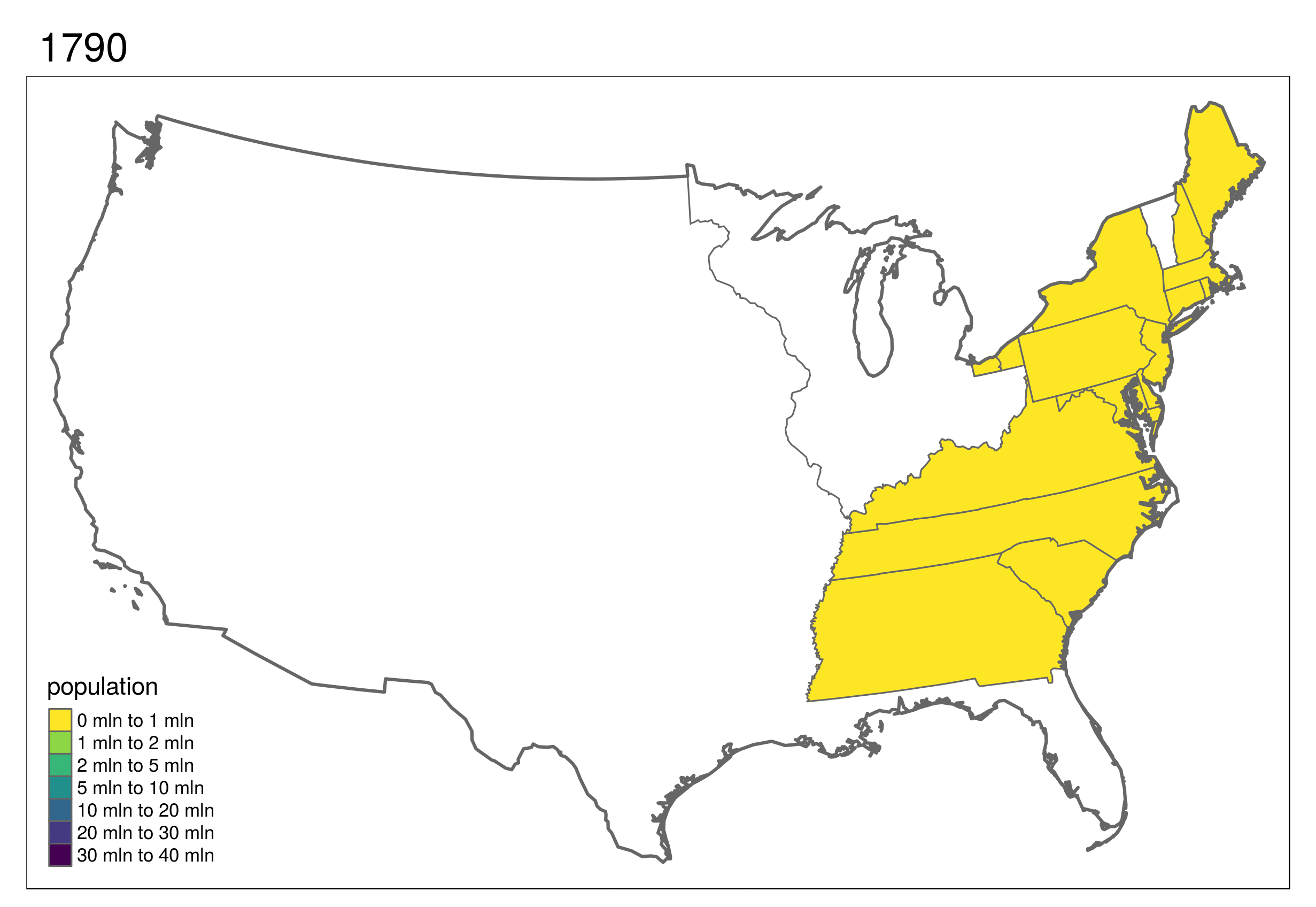
This shows the development of states in the United States, which first formed in the east and then incrementally to the west and finally into the interior.
Code to reproduce this map can be found in the script 09-usboundaries.R.
(\#fig:animus)Animated map showing population growth, state formation and boundary changes in the United States, 1790-2010. Animated version available online at r.geocompx.org.
交互地图
\index{map making!interactive maps} \index{tmap (package)!interactive maps} While static and animated maps can enliven geographic datasets, interactive maps can take them to a new level.
Interactivity can take many forms, the most common and useful of which is the ability to pan around and zoom into any part of a geographic dataset overlaid on a ‘web map’ to show context.
Less advanced interactivity levels include popups which appear when you click on different features, a kind of interactive label.
More advanced levels of interactivity include the ability to tilt and rotate maps, as demonstrated in the mapdeck example below, and the provision of “dynamically linked” sub-plots which automatically update when the user pans and zooms.
The most important type of interactivity, however, is the display of geographic data on interactive or ‘slippy’ web maps.
The release of the leaflet package in 2015 (that uses the leaflet JavaScript library) revolutionized interactive web map creation from within R and a number of packages have built on these foundations adding new features (e.g., leaflet.extras) and making the creation of web maps as simple as creating static maps (e.g., mapview and tmap).
This section illustrates each approach in the opposite order.
We will explore how to make slippy maps with tmap (the syntax of which we have already learned), mapview\index{mapview (package)}, mapdeck\index{mapdeck (package)} and finally leaflet\index{leaflet (package)} (which provides low-level control over interactive maps).
A unique feature of tmap mentioned in Section @ref(static-maps) is its ability to create static and interactive maps using the same code.
Maps can be viewed interactively at any point by switching to view mode, using the command tmap_mode("view").
This is demonstrated in the code below, which creates an interactive map of New Zealand based on the tmap object map_nz, created in Section @ref(map-obj), and illustrated in Figure @ref(fig:tmview):
1 2
tmap_mode("view") map_nz
(\#fig:tmview)Interactive map of New Zealand created with tmap in view mode. Interactive version available online at: r.geocompx.org.
Now that the interactive mode has been ‘turned on’, all maps produced with tmap will launch (another way to create interactive maps is with the tmap_leaflet() function).
Notable features of this interactive mode include the ability to specify the basemap with tm_basemap() (or tmap_options()) as demonstrated below (result not shown):
1
map_nz + tm_basemap(server ="OpenTopoMap")
An impressive and little-known feature of tmap’s view mode is that it also works with faceted plots.
The argument sync in tm_facets() can be used in this case to produce multiple maps with synchronized zoom and pan settings, as illustrated in Figure @ref(fig:sync), which was produced by the following code:
(\#fig:sync)Faceted interactive maps of global coffee production in 2016 and 2017 in sync, demonstrating tmap's view mode in action.
Switch tmap back to plotting mode with the same function:
1 2
tmap_mode("plot") #> tmap mode set to 'plot'
If you are not proficient with tmap, the quickest way to create interactive maps in R may be with mapview\index{mapview (package)}.
The following ‘one liner’ is a reliable way to interactively explore a wide range of geographic data formats:
1
mapview::mapview(nz)
(\#fig:mapview)Illustration of mapview in action.
mapview has a concise syntax yet is powerful.
By default, it has some standard GIS functionality such as mouse position information, attribute queries (via pop-ups), scale bar, and zoom-to-layer buttons.
It also offers advanced controls including the ability to ‘burst’ datasets into multiple layers and the addition of multiple layers with + followed by the name of a geographic object.
Additionally, it provides automatic coloring of attributes via the zcol argument.
In essence, it can be considered a data-driven leaflet API\index{API} (see below for more information about leaflet).
Given that mapview always expects a spatial object (including sf and SpatRaster) as its first argument, it works well at the end of piped expressions.
Consider the following example where sf is used to intersect lines and polygons and then is visualized with mapview (Figure @ref(fig:mapview2)).
(\#fig:mapview2)Using mapview at the end of a sf-based pipe expression.
One important thing to keep in mind is that mapview layers are added via the + operator (similar to ggplot2 or tmap).
By default, mapview uses the leaflet JavaScript library to render the output maps, which is user-friendly and has a lot of features.
However, some alternative rendering libraries could be more performant (work more smoothly on larger datasets). mapview allows to set alternative rendering libraries ("leafgl" and "mapdeck") in the mapviewOptions().[^6]
For further information on mapview, see the package’s website at: r-spatial.github.io/mapview/.
[^6]: You may also try to use mapviewOptions(georaster = TRUE) for more performant visualizations of large raster data.
There are other ways to create interactive maps with R.
The googleway package\index{googleway (package)}, for example, provides an interactive mapping interface that is flexible and extensible (see the googleway-vignette for details).
Another approach by the same author is mapdeck, which provides access to Uber’s Deck.gl framework\index{mapdeck (package)}.
Its use of WebGL enables it to interactively visualize large datasets up to millions of points.
The package uses Mapbox access tokens, which you must register for before using the package.
\BeginKnitrBlock{rmdnote}
Note that the following block assumes the access token is stored in your R environment as MAPBOX=your_unique_key.
This can be added with usethis::edit_r_environ().
\EndKnitrBlock{rmdnote}
A unique feature of mapdeck is its provision of interactive 2.5D perspectives, illustrated in Figure @ref(fig:mapdeck).
This means you can can pan, zoom and rotate around the maps, and view the data ‘extruded’ from the map.
Figure @ref(fig:mapdeck), generated by the following code chunk, visualizes road traffic crashes in the UK, with bar height representing casualties per area.
(\#fig:mapdeck)Map generated by mapdeck, representing road traffic casualties across the UK. Height of 1 km cells represents number of crashes.
You can zoom and drag the map in the browser, in addition to rotating and tilting it when pressing Cmd/Ctrl.
Multiple layers can be added with the pipe operator, as demonstrated in the mapdeck vignettes. mapdeck also supports sf objects, as can be seen by replacing the add_grid() function call in the preceding code chunk with add_polygon(data = lnd, layer_id = "polygon_layer"), to add polygons representing London to an interactive tilted map.
Last but not least is leaflet which is the most mature and widely used interactive mapping package in R\index{leaflet (package)}. leaflet provides a relatively low-level interface to the Leaflet JavaScript library and many of its arguments can be understood by reading the documentation of the original JavaScript library (see leafletjs.com).
Leaflet maps are created with leaflet(), the result of which is a leaflet map object which can be piped to other leaflet functions.
This allows multiple map layers and control settings to be added interactively, as demonstrated in the code below which generates Figure @ref(fig:leaflet) (see rstudio.github.io/leaflet/ for details).
(\#fig:leaflet)The leaflet package in action, showing cycle hire points in London. See interactive version [online](https://geocompr.github.io/img/leaflet.html).
地图应用
\index{map making!mapping applications} The interactive web maps demonstrated in Section @ref(interactive-maps) can go far.
Careful selection of layers to display, base-maps and pop-ups can be used to communicate the main results of many projects involving geocomputation.
But the web mapping approach to interactivity has limitations:
Although the map is interactive in terms of panning, zooming and clicking, the code is static, meaning the user interface is fixed
All map content is generally static in a web map, meaning that web maps cannot scale to handle large datasets easily
Additional layers of interactivity, such a graphs showing relationships between variables and ‘dashboards’ are difficult to create using the web-mapping approach
Overcoming these limitations involves going beyond static web mapping and towards geospatial frameworks and map servers.
Products in this field include GeoDjango\index{GeoDjango} (which extends the Django web framework and is written in Python)\index{Python}, MapServer\index{MapServer} (a framework for developing web applications, largely written in C and C++)\index{C++} and GeoServer (a mature and powerful map server written in Java\index{Java}).
Each of these is scalable, enabling maps to be served to thousands of people daily, assuming there is sufficient public interest in your maps!
The bad news is that such server-side solutions require much skilled developer time to set-up and maintain, often involving teams of people with roles such as a dedicated geospatial database administrator (DBA).
Fortunately for R programmers, web mapping applications can now be rapidly created wih shiny.\index{shiny (package)} As described in the open source book Mastering Shiny, shiny is an R package and framework for converting R code into interactive web applications.
You can embed interactive maps in shiny apps thanks to functions such as tmap::renderTmap() and leaflet::renderLeaflet().
This section gives some context, teaches the basics of shiny from a web mapping perspective and culminates in a full-screen mapping application in less than 100 lines of code.
shiny is well documented at shiny.rstudio.com, which highlights the two components of every shiny app: ‘front end’ (the bit the user sees) and ‘back end’ code.
In shiny apps, these elements are typically created in objects named ui and server within an R script named app.R, which lives in an ‘app folder’.
This allows web mapping applications to be represented in a single file, such as the CycleHireApp/app.R file in the book’s GitHub repo.
\BeginKnitrBlock{rmdnote}
In shiny apps these are often split into ui.R (short for user interface) and server.R files, naming conventions used by shiny-server, a server-side Linux application for serving shiny apps on public-facing websites. shiny-server also serves apps defined by a single app.R file in an ‘app folder’.
Learn more at: https://github.com/rstudio/shiny-server.
\EndKnitrBlock{rmdnote}
Before considering large apps, it is worth seeing a minimal example, named ‘lifeApp’, in action.[^7]
The code below defines and launches — with the command shinyApp() — a lifeApp, which provides an interactive slider allowing users to make countries appear with progressively lower levels of life expectancy (see Figure @ref(fig:lifeApp)):
[^7]: The word ‘app’ in this context refers to ‘web application’ and should not be confused with smartphone apps, the more common meaning of the word.
1 2 3 4 5 6 7 8 9 10 11 12 13 14
library(shiny)# for shiny apps library(leaflet)# renderLeaflet function library(spData)# loads the world dataset ui = fluidPage( sliderInput(inputId ="life","Life expectancy",49,84, value =80), leafletOutput(outputId ="map") ) server =function(input, output){ output$map = renderLeaflet({ leaflet()|> # addProviderTiles("OpenStreetMap.BlackAndWhite") |> addPolygons(data = world[world$lifeExp < input$life,])}) } shinyApp(ui, server)
(\#fig:lifeApp)Screenshot showing minimal example of a web mapping application created with shiny.
The user interface (ui) of lifeApp is created by fluidPage().
This contains input and output ‘widgets’ — in this case, a sliderInput() (many other *Input() functions are available) and a leafletOutput().
These are arranged row-wise by default, explaining why the slider interface is placed directly above the map in Figure @ref(fig:lifeApp) (see ?column for adding content column-wise).
The server side (server) is a function with input and output arguments. output is a list of objects containing elements generated by render*() function — renderLeaflet() which in this example generates output$map.
Input elements such as input$life referred to in the server must relate to elements that exist in the ui — defined by inputId = "life" in the code above.
The function shinyApp() combines both the ui and server elements and serves the results interactively via a new R process.
When you move the slider in the map shown in Figure @ref(fig:lifeApp), you are actually causing R code to re-run, although this is hidden from view in the user interface.
Building on this basic example and knowing where to find help (see ?shiny), the best way forward now may be to stop reading and start programming!
The recommended next step is to open the previously mentioned CycleHireApp/app.R script in an IDE of choice, modify it and re-run it repeatedly.
The example contains some of the components of a web mapping application implemented in shiny and should ‘shine’ a light on how they behave.
The CycleHireApp/app.R script contains shiny functions that go beyond those demonstrated in the simple ‘lifeApp’ example.
These include reactive() and observe() (for creating outputs that respond to the user interface — see ?reactive) and leafletProxy() (for modifying a leaflet object that has already been created).
Such elements are critical to the creation of web mapping applications implemented in shiny.
A range of ‘events’ can be programmed including advanced functionality such as drawing new layers or subsetting data, as described in the shiny section of RStudio’s leafletwebsite.
\BeginKnitrBlock{rmdnote}
There are a number of ways to run a shiny app.
For RStudio users, the simplest way is probably to click on the ‘Run App’ button located in the top right of the source pane when an app.R, ui.R or server.R script is open. shiny apps can also be initiated by using runApp() with the first argument being the folder containing the app code and data: runApp("CycleHireApp") in this case (which assumes a folder named CycleHireApp containing the app.R script is in your working directory).
You can also launch apps from a Unix command line with the command Rscript -e 'shiny::runApp("CycleHireApp")'.
\EndKnitrBlock{rmdnote}
Experimenting with apps such as CycleHireApp will build not only your knowledge of web mapping applications in R, but also your practical skills.
Changing the contents of setView(), for example, will change the starting bounding box that the user sees when the app is initiated.
Such experimentation should not be done at random, but with reference to relevant documentation, starting with ?shiny, and motivated by a desire to solve problems such as those posed in the exercises.
shiny used in this way can make prototyping mapping applications faster and more accessible than ever before (deploying shiny apps, https://shiny.rstudio.com/deploy/, is a separate topic beyond the scope of this chapter).
Even if your applications are eventually deployed using different technologies, shiny undoubtedly allows web mapping applications to be developed in relatively few lines of code (86 in the case of CycleHireApp).
That does not stop shiny apps getting rather large.
The Propensity to Cycle Tool (PCT) hosted at pct.bike, for example, is a national mapping tool funded by the UK’s Department for Transport.
The PCT is used by dozens of people each day and has multiple interactive elements based on more than 1000 lines of code.
While such apps undoubtedly take time and effort to develop, shiny provides a framework for reproducible prototyping that should aid the development process.
One potential problem with the ease of developing prototypes with shiny is the temptation to start programming too early, before the purpose of the mapping application has been envisioned in detail.
For that reason, despite advocating shiny, we recommend starting with the longer established technology of a pen and paper as the first stage for interactive mapping projects.
This way your prototype web applications should be limited not by technical considerations, but by your motivations and imagination.
(\#fig:CycleHireApp-html)CycleHireApp, a simple web mapping application for finding the closest cycle hiring station based on your location and requirement of cycles. Interactive version available online at r.geocompx.org.
其他地图包
tmap provides a powerful interface for creating a wide range of static maps (Section @ref(static-maps)) and also supports interactive maps (Section @ref(interactive-maps)).
But there are many other options for creating maps in R.
The aim of this section is to provide a taster of some of these and pointers for additional resources: map making is a surprisingly active area of R package development, so there is more to learn than can be covered here.
The most mature option is to use plot() methods provided by core spatial packages sf and terra, covered in Sections @ref(basic-map) and @ref(basic-map-raster), respectively.
What we have not mentioned in those sections was that plot methods for vector and raster objects can be combined when the results draw onto the same plot area (elements such as keys in sf plots and multi-band rasters will interfere with this).
This behavior is illustrated in the subsequent code chunk which generates Figure @ref(fig:nz-plot). plot() has many other options which can be explored by following links in the ?plot help page and the sf vignette sf5.
1 2 3 4
g = st_graticule(nz, lon =c(170,175), lat =c(-45,-40,-35)) plot(nz_water, graticule = g, axes =TRUE, col ="blue") terra::plot(nz_elev /1000, add =TRUE, axes =FALSE) plot(st_geometry(nz), add =TRUE)
(\#fig:nz-plot)Map of New Zealand created with plot(). The legend to the right refers to elevation (1000 m above sea level).
The tidyverse\index{tidyverse (package)} plotting package ggplot2 also supports sf objects with geom_sf()\index{ggplot2 (package)}.
The syntax is similar to that used by tmap: an initial ggplot() call is followed by one or more layers, that are added with + geom_*(), where * represents a layer type such as geom_sf() (for sf objects) or geom_points() (for points).
ggplot2 plots graticules by default.
The default settings for the graticules can be overridden using scale_x_continuous(), scale_y_continuous() or coord_sf(datum = NA).
Other notable features include the use of unquoted variable names encapsulated in aes() to indicate which aesthetics vary and switching data sources using the data argument, as demonstrated in the code chunk below which creates Figure @ref(fig:nz-gg2):
Another benefit of maps based on ggplot2 is that they can easily be given a level of interactivity when printed using the function ggplotly() from the plotly package\index{plotly (package)}.
Try plotly::ggplotly(g1), for example, and compare the result with other plotly mapping functions described at: blog.cpsievert.me.
An advantage of ggplot2 is that it has a strong user community and many add-on packages.
It includes ggspatial, which enhances ggplot2’s mapping capabilities by providing options to add a north arrow (annotation_north_arrow()) and a scale bar (annotation_scale()), or to add background tiles (annotation_map_tile()).
It also accepts various spatial data classes with layer_spatial().
Thus, we are able to plot SpatRaster objects from terra using this function as seen in Figure @ref(fig:nz-gg2).
(\#fig:nz-gg2)Comparison of map of New Zealand created with ggplot2 alone (left) and ggplot2 and ggspatial (right).
At the same time, ggplot2 has a few drawbacks, for example the geom_sf() function is not always able to create a desired legend to use from the spatial data.
Good additional ggplot2 resources can be found in the open source ggplot2 book and in the descriptions of the multitude of ‘ggpackages’ such as ggrepel and tidygraph.
We have covered mapping with sf, terra and ggplot2 first because these packages are highly flexible, allowing for the creation of a wide range of static maps.
Before we cover mapping packages for plotting a specific type of map (in the next paragraph), it is worth considering alternatives to the packages already covered for general-purpose mapping (Table @ref(tab:map-gpkg)).
Create Elegant Data Visualisations Using the Grammar of Graphics
googleway
Accesses Google Maps APIs to Retrieve Data and Plot Maps
ggspatial
Spatial Data Framework for ggplot2
leaflet
Create Interactive Web Maps with Leaflet
mapview
Interactive Viewing of Spatial Data in R
plotly
Create Interactive Web Graphics via 'plotly.js'
rasterVis
Visualization Methods for Raster Data
tmap
Thematic Maps
Table @ref(tab:map-gpkg) shows a range of mapping packages are available, and there are many others not listed in this table.
Of note is mapsf, which can generate range of geographic visualizations including choropleth, ‘proportional symbol’ and ‘flow’ maps.
These are documented in the mapsf\index{mapsf (package)} vignette.
Several packages focus on specific map types, as illustrated in Table @ref(tab:map-spkg).
Such packages create cartograms that distort geographical space, create line maps, transform polygons into regular or hexagonal grids, visualize complex data on grids representing geographic topologies, and create 3D visualizations.
(\#tab:map-spkg)Selected specific-purpose mapping packages, with associated metrics.
Package
Title
cartogram
Create Cartograms with R
geogrid
Turn Geospatial Polygons into Regular or Hexagonal Grids
geofacet
'ggplot2' Faceting Utilities for Geographical Data
linemap
Line Maps
tanaka
Design Shaded Contour Lines (or Tanaka) Maps
rayshader
Create Maps and Visualize Data in 2D and 3D
All of the aforementioned packages, however, have different approaches for data preparation and map creation.
In the next paragraph, we focus solely on the cartogram package\index{cartogram (package)}.
Therefore, we suggest to read the linemap\index{linemap (package)}, geogrid\index{geogrid (package)}, geofacet\index{geofacet (package)}, and rayshader\index{rayshader (package)} documentations to learn more about them.
A cartogram is a map in which the geometry is proportionately distorted to represent a mapping variable.
Creation of this type of map is possible in R with cartogram, which allows for creating continuous and non-contiguous area cartograms.
It is not a mapping package per se, but it allows for construction of distorted spatial objects that could be plotted using any generic mapping package.
The cartogram_cont() function creates continuous area cartograms.
It accepts an sf object and name of the variable (column) as inputs.
Additionally, it is possible to modify the intermax argument - maximum number of iterations for the cartogram transformation.
For example, we could represent median income in New Zeleand’s regions as a continuous cartogram (the right-hand panel of Figure @ref(fig:cartomap1)) as follows:
#> Warning: Some legend items or map compoments do not fit well (e.g. due to the #> specified font size).
#> Warning: Some legend items or map compoments do not fit well (e.g. due to the #> specified font size).
(\#fig:cartomap1)Comparison of standard map (left) and continuous area cartogram (right).
cartogram also offers creation of non-contiguous area cartograms using cartogram_ncont() and Dorling cartograms using cartogram_dorling().
Non-contiguous area cartograms are created by scaling down each region based on the provided weighting variable.
Dorling cartograms consist of circles with their area proportional to the weighting variable.
The code chunk below demonstrates creation of non-contiguous area and Dorling cartograms of US states’ population (Figure @ref(fig:cartomap2)):
These exercises rely on a new object, africa.
Create it using the world and worldbank_df datasets from the spData package as follows:
1 2 3 4 5 6 7 8
library(spData) africa = world |> filter(continent =="Africa",!is.na(iso_a2))|> left_join(worldbank_df, by ="iso_a2")|> select(name, subregion, gdpPercap, HDI, pop_growth)|> st_transform("ESRI:102022")|> st_make_valid()|> st_collection_extract("POLYGON")
We will also use zion and nlcd datasets from spDataLarge:
1
2
zion = read_sf((system.file("vector/zion.gpkg", package ="spDataLarge"))) nlcd = rast(system.file("raster/nlcd.tif", package ="spDataLarge"))
E1. Create a map showing the geographic distribution of the Human Development Index (HDI) across Africa with base graphics (hint: use plot()) and tmap packages (hint: use tm_shape(africa) + ...).
- Name two advantages of each based on the experience.
- Name three other mapping packages and an advantage of each.
- Bonus: create three more maps of Africa using these three other packages.
E2. Extend the tmap created for the previous exercise so the legend has three bins: “High” (HDI above 0.7), “Medium” (HDI between 0.55 and 0.7) and “Low” (HDI below 0.55).
- Bonus: improve the map aesthetics, for example by changing the legend title, class labels and color palette.
E3. Represent africa’s subregions on the map.
Change the default color palette and legend title.
Next, combine this map and the map created in the previous exercise into a single plot.
E4. Create a land cover map of the Zion National Park.
- Change the default colors to match your perception of the land cover categories
- Add a scale bar and north arrow and change the position of both to improve the map’s aesthetic appeal
- Bonus: Add an inset map of Zion National Park’s location in the context of the Utah state. (Hint: an object representing Utah can be subset from the us_states dataset.)
E5. Create facet maps of countries in Eastern Africa:
- With one facet showing HDI and the other representing population growth (hint: using variables HDI and pop_growth, respectively)
- With a ‘small multiple’ per country
E6. Building on the previous facet map examples, create animated maps of East Africa:
- Showing each country in order
- Showing each country in order with a legend showing the HDI
E7. Create an interactive map of HDI in Africa:
- With tmap
- With mapview
- With leaflet
- Bonus: For each approach, add a legend (if not automatically provided) and a scale bar
E8. Sketch on paper ideas for a web mapping app that could be used to make transport or land-use policies more evidence based:
- In the city you live, for a couple of users per day
- In the country you live, for dozens of users per day
- Worldwide for hundreds of users per day and large data serving requirements
E9. Update the code in coffeeApp/app.R so that instead of centering on Brazil the user can select which country to focus on:
- Using textInput()
- Using selectInput()
E10. Reproduce Figure 9.1 and Figure 9.7 as closely as possible using the ggplot2 package.
E11. Join us_states and us_states_df together and calculate a poverty rate for each state using the new dataset.
Next, construct a continuous area cartogram based on total population.
Finally, create and compare two maps of the poverty rate: (1) a standard choropleth map and (2) a map using the created cartogram boundaries.
What is the information provided by the first and the second map?
How do they differ from each other?
E12. Visualize population growth in Africa.
Next, compare it with the maps of a hexagonal and regular grid created using the geogrid package.


.](figures/leaflet-1.png)


